GeorgeHarrison
Brand Development & Official Website
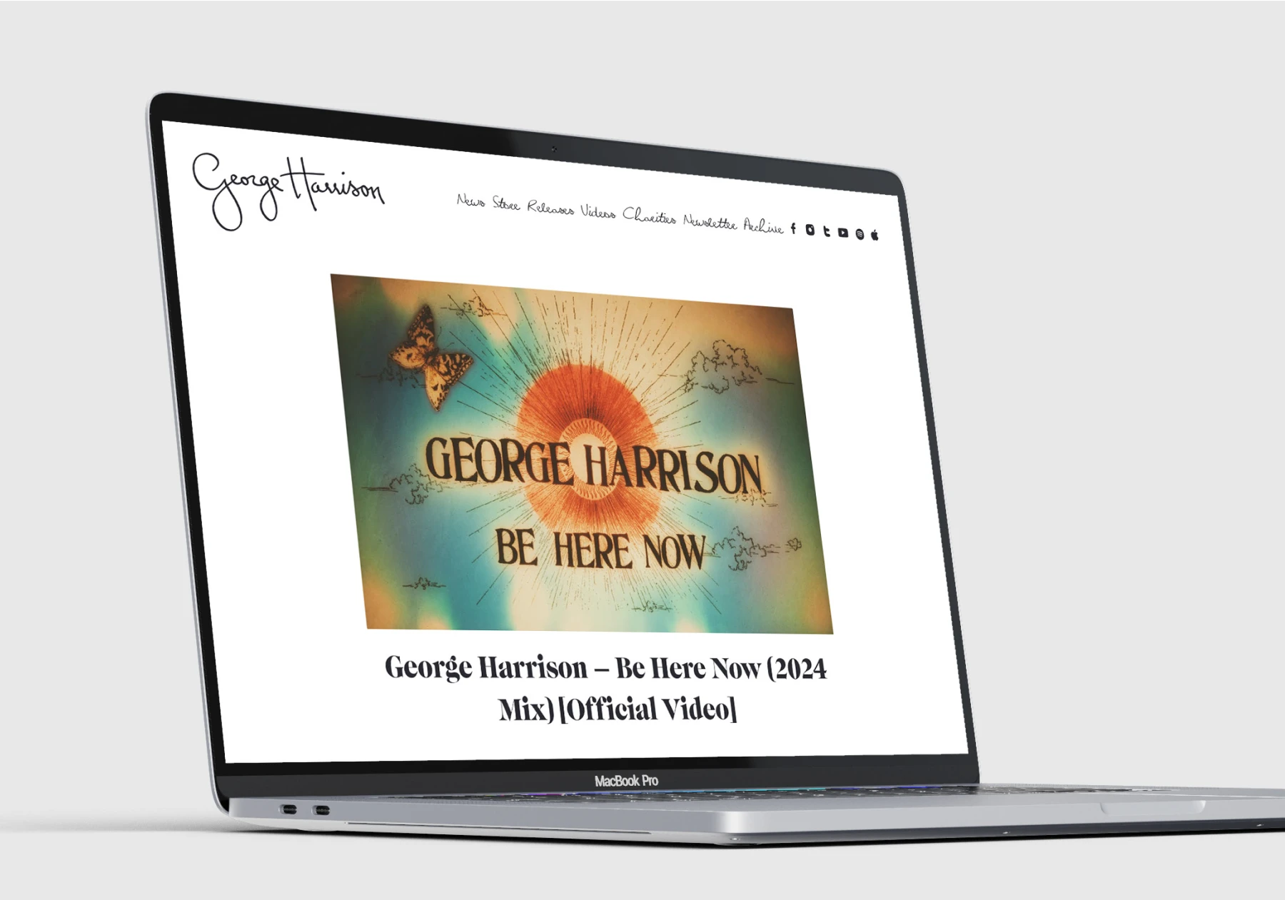
We’re still pinching ourselves about being invited by George’s family to be involved in this incredible project. Our role was to create a brand new identity, retaining the essence of George’s own signature, and create one of the most strategic websites we’ve ever produced.
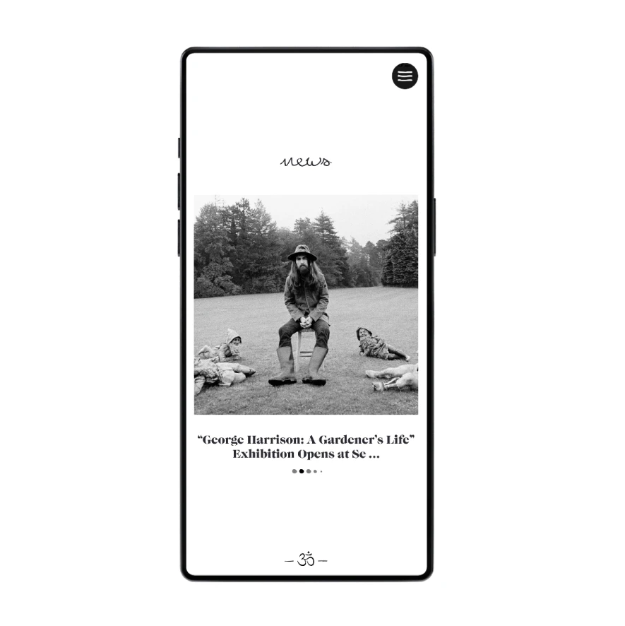
As the project evolved, we created a bespoke font using George’s own hand-writing, taken from the various notes and hand-written lyrics. This would become a key visual element that brings everything together. Giving the visual aesthetic a personal touch.
The same personal touch was carried through to George’s new website. We wanted it to feel as though George was a part of it, scribbling his notes across the page.
This was built on a simple framework, with a powerful management system that allows the website manager to customise the website to support any form of marketing activity, by simply clicking a few buttons.


A key element from the website that brought everything together was the creation of a colour palette for each album.


