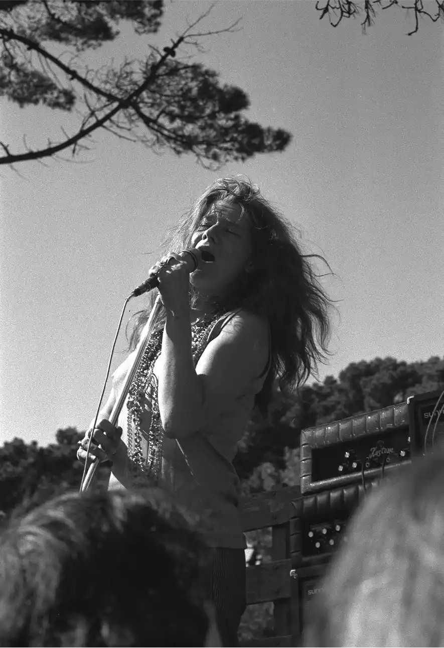
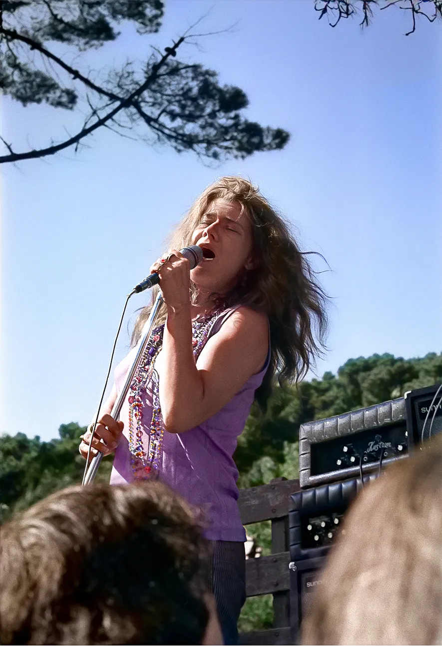
Janis Joplin Brand & Official Website
A bold new visual language for one of music’s most electrifying legacies, uniting the raw power of Janis Joplin’s voice with a modern identity built to resonate across generations.
The Creative Corporation partnered with the Janis Joplin Estate to create a cohesive new visual identity and website, capturing the raw spirit of Janis Joplin while opening the door to future collaborations, campaigns, and new generations of fans.
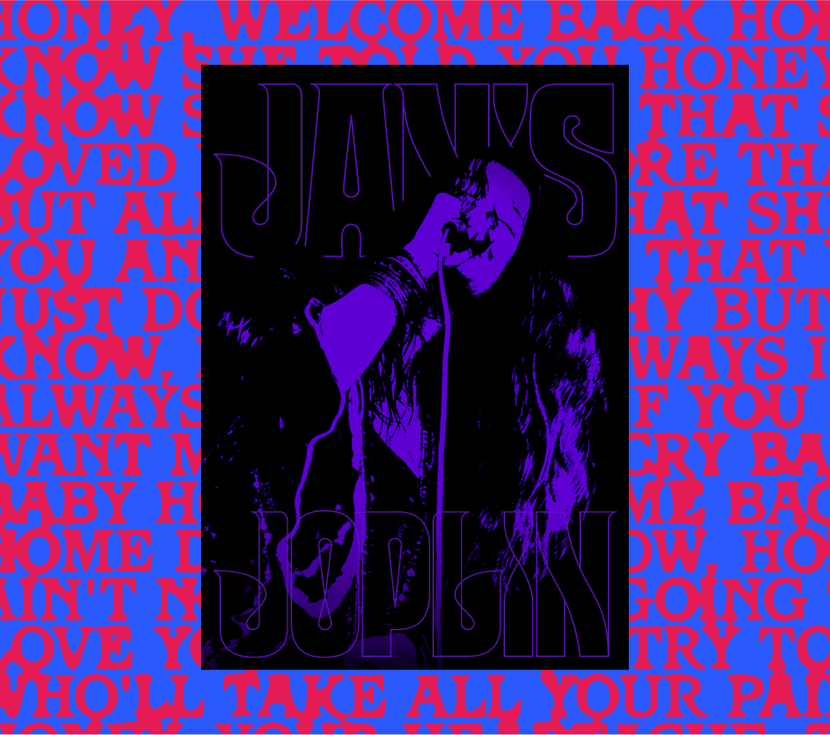
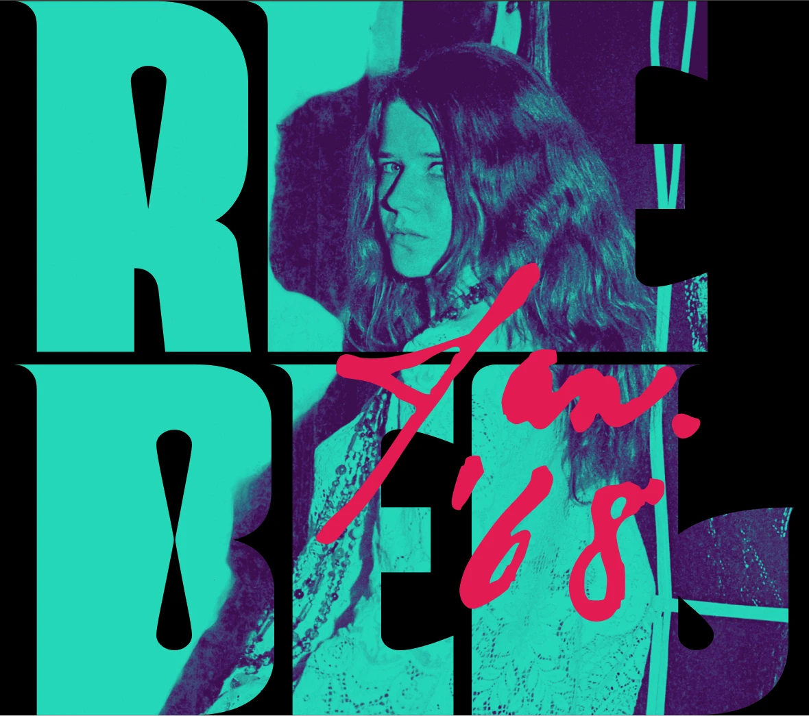
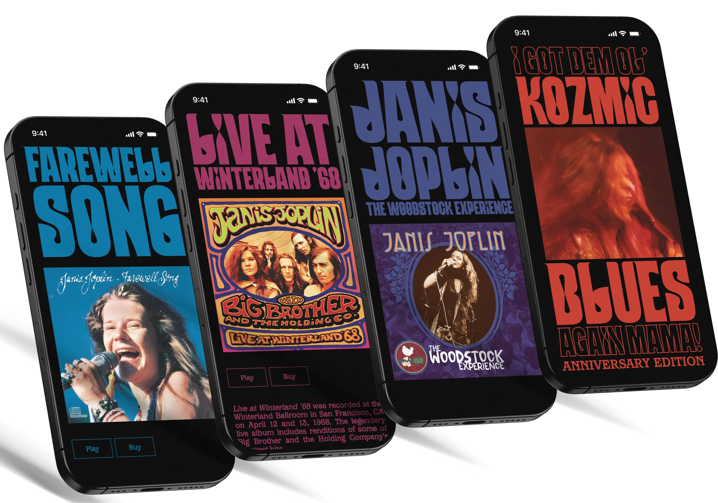
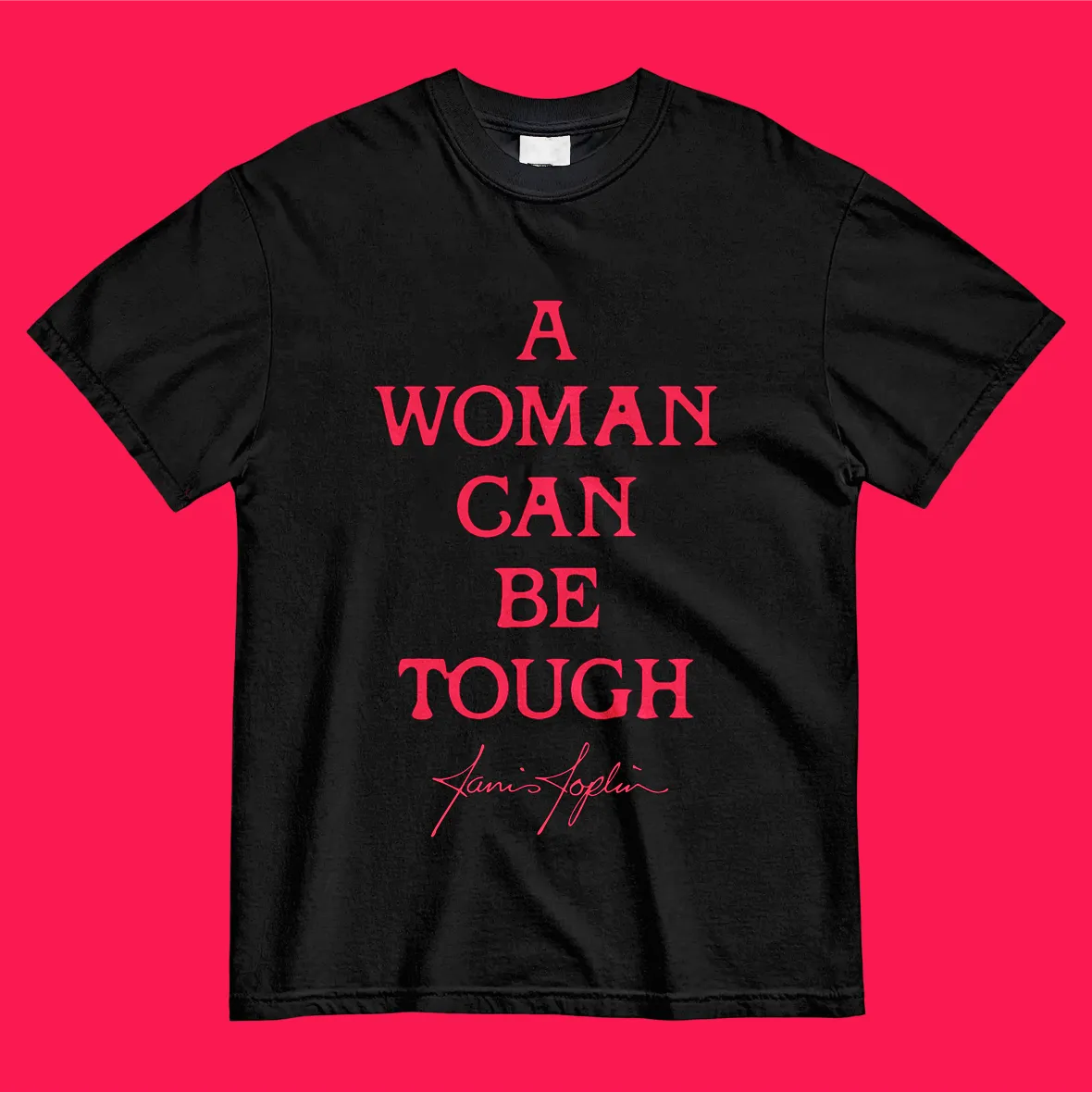
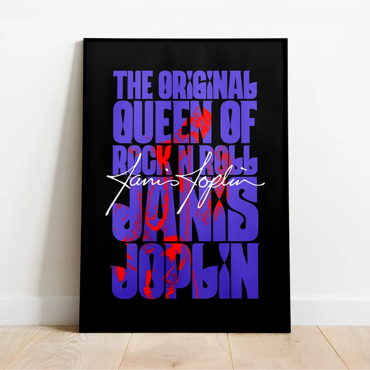
At the centre of the brand is a bespoke typeface called ‘Janis’- expressive, imperfect, and full of movement, inspired by Janis’s own handwriting and the wild, freeform lettering of the late 60s. Drawn from scratch to feel hand-crafted rather than ornamental, the font forms the backbone of a spirited and flexible design system, deeply rooted in Janis’s visual world.
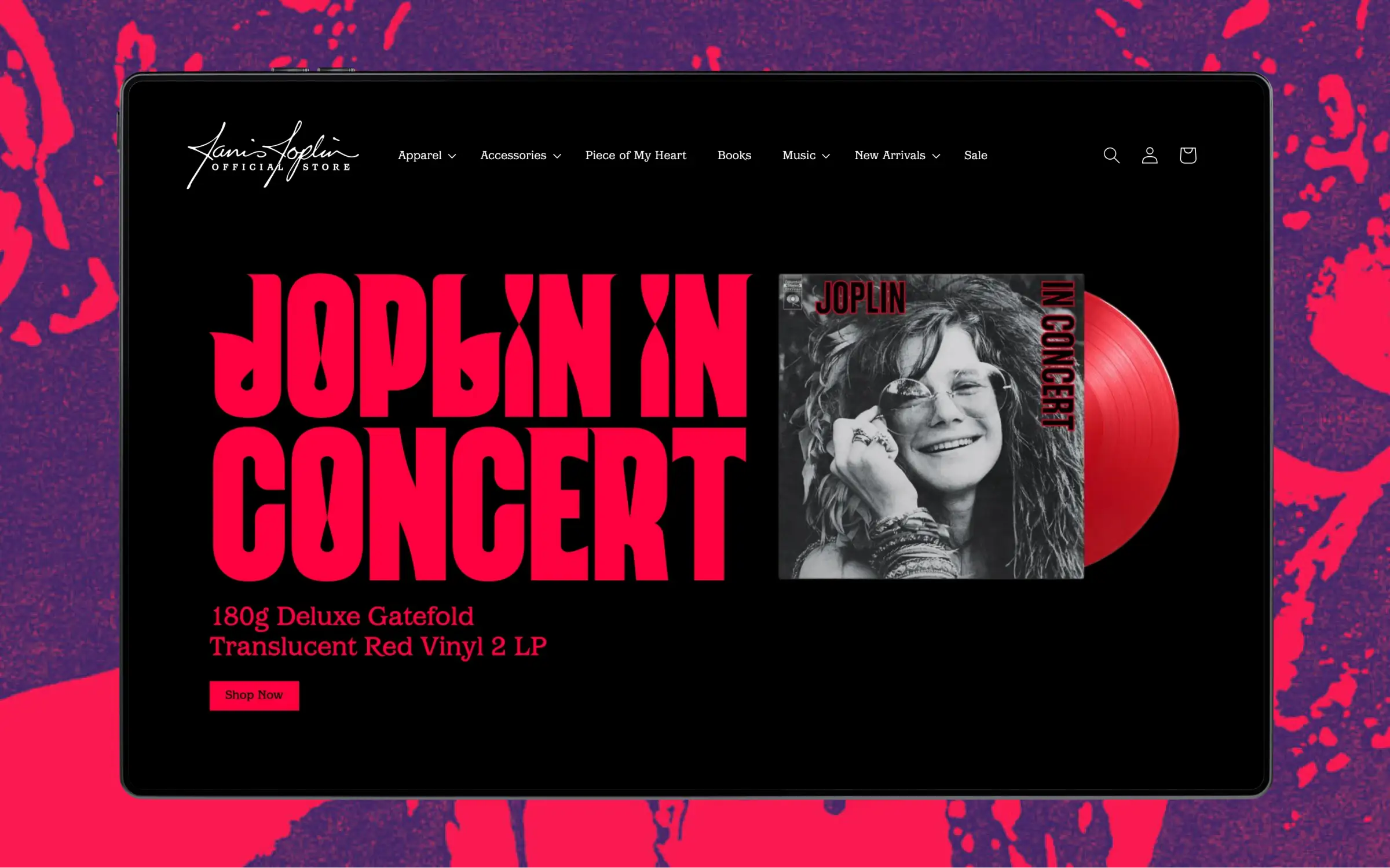
The wider identity channels the visual energy of late-60s counterculture: vivid colours, trippy layouts, and tactile textures that echo the posters, zines, and street ephemera of the time. A supporting type system, expanded colour palette, and modular layout language were created to work seamlessly across digital, editorial, merchandise, and social giving Janis’s voice a powerful, renewed presence across modern platforms.
The new website brings together music, biography, releases, merchandise, and archive material in one cohesive experience. Designed with a long-term SEO strategy and built on WordPress, it’s scalable, adaptable, and future-ready built to support the estate’s evolving marketing, storytelling, and product development ambitions.
Janis outline

Enquiries
contact@thecreativecorporation.com
Other Work
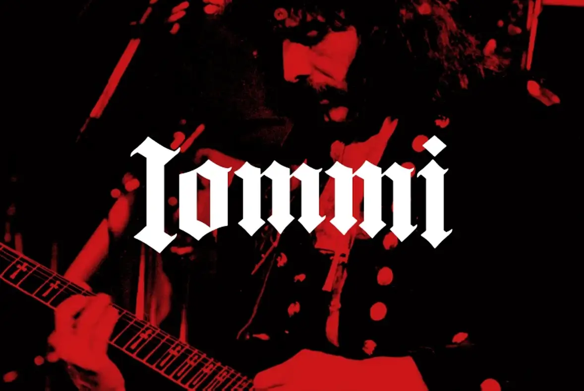
Tony Iommi Brand & Official Website
A forged identity for the godfather of heavy metal, crafted to honour five decades of influence while powering the next era of Tony Iommi’s creative output across every digital touchpoint.